Go back?
lemon logo

Onboarding UI Redesign

PROJECT INTRODUCTION

Below is the recsult of the collaboration between my team (Elise Carman, Gianna Aiello, Karina Valrani) and Zest- an online gifting platform helping brands scale by streamlining the gift-buying experience directly on their website. It offers multi-ship checkout, e-gifting, and corporate storefronts, with a concierge feature for brands to manage or process orders. Our redesign transforms a fragmented, self-guided setup process into a structured, intuitive flow that reduces reliance on customer support, shortens time to completion, and improves overall usability.

lemon logo lemon logo

CONSIDERATIONS/GOALS

Zest entrusted us with redesigning their onboarding process for new vendors. A few considerations we took into account when brainstorming collectively the new UI:

PROBLEM STATEMENT

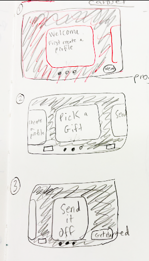
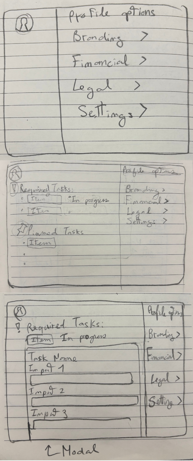
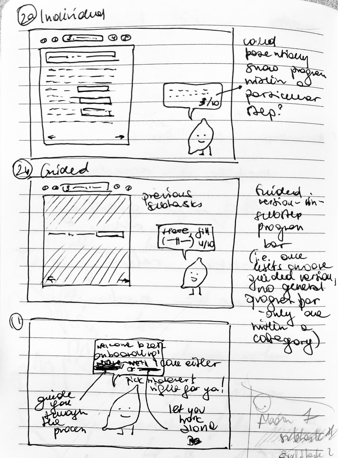
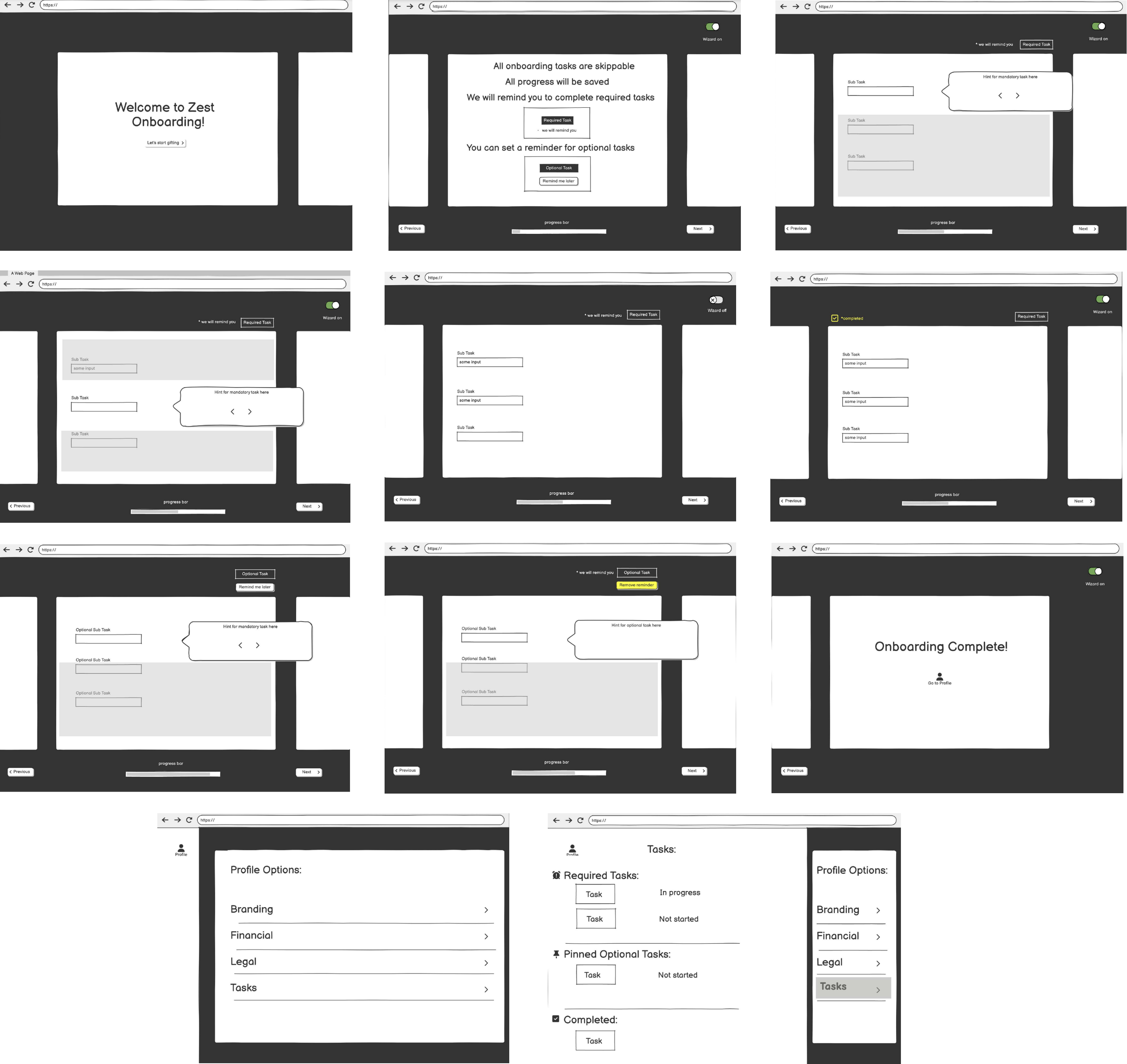
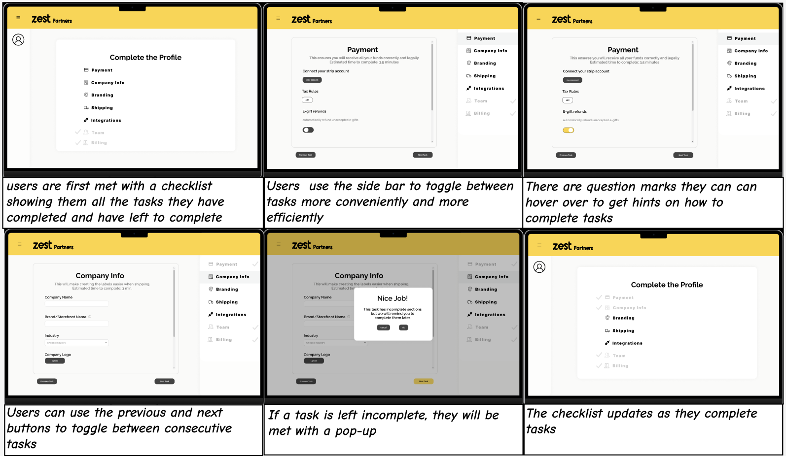
Users must complete a series of setup tasks before they can fully operate within Zest. These tasks range from integrating with Shopify to defining shipping rules. Some tasks are required for functionality while others are optional.
USER IDENTITY

Zest clients often operate as teams rather than individuals. We should expect a client's finance team to provide details for Stripe Integration, while the marketing team handles branding. This implies the onboarding most likely cannot be completed in one go, and jumping around sections should be enabled.
USER MOTIVATIONS

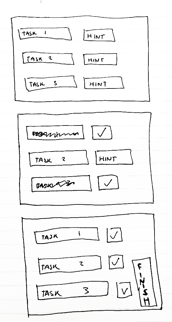
Users can only start using the platform once they have properly onboarded. They don't have a lot of time or energy to spend on onboarding, and need to get to their actual task as quickly as possible.
PAIN POINTS

Historically new clients have requested customer success meetings to correctly finish onboarding. There is no in app guided process besides a task checklist, and customers have pointed out a lack of clear instructions. The existing in app guidance must be improved.

SKETCHES

We started by creating sketches to help visualize our ideas, weigh the benefits of alternative designs, and avoid premature decision-making. We focused on a desktop interface, with my design (sketch 4) focusing on interactivity, wizard guidance (potentially toggled off), and playful visuals:

Sketch 1

Empathy Map for Anxious Amber - the unsure freshman

Sketch 2

Empathy Map for Joyful Jamie - the confident senior

Sketch 3

Empathy Map for Anxious Amber - the unsure freshman

Sketch 4

Empathy Map for Joyful Jamie - the confident senior

DESIGN DECISIONS

When designing our solution, we noticed that it is crucial that tasks are skippable, given that clients may not have all the information at the time of onboarding. In order to ensure that clients can be aided in the process of onboarding while still being able to keep track of tasks that they have completed/ still need to complete, we made 4 key design choices.

Carousels
Wizards
Pinning tasks
Progress bar

LO-FI WIREFRAMES

We then made a low-fi prototype as a set of wireframes in Balsamiq.

Lo-Fi wireframes


lemon logo

LO-FI WALKTHROUGH

CRITIQUES

Having received feedback and clarifications from the company, through discussions with a mentor regarding the lo-fi prototypes, our team reworked our initial proposal. Press on the boxes for a detailed overview of the changes made.

Starting Screen
Wizard
Carousel
Toggling between Tasks
Reminders
Improving User Experience

HI-FI WIREFRAMES

Having reflected on the feedback received, we incorporated our new ideas into the mock-up of the final product, presented below.

FINAL PROTOTYPE

In our most recent meeting with our mentor, we discussed the importance of designing for the “general user” - someone who may be either highly experienced with similar systems or completely new to onboarding functionalities. While we've removed the "wizard" option in prior interations - as it would greatly slow down the former group - we kept the "show hint" option, which Christine appreciated. We've also discussed the necessity of keeping the end-user engaged through the process, and it's certainly an aspect we'd improve on in the future. Our current impersonal task view could be potentially preceded with a welcome page greeting the user on first run. The transitions between tasks could also be enhanced, possibly with a carousel animation, as pictured in our lo-fi prototypes. We've also been asked about the progress bar, which we ultimately decided to replace with "estimated completion time" as we were unsure whether the former would relate to all subtasks or just the required ones. In future versions, we'd compare the efficiency of the two, by analyzing their corresponding bounce rates.

Walkthrough:

Prototype: