The Politechnika Krakowska website serves as a critical hub for prospective students, researchers, and staff, yet its current design fails to meet modern usability and accessibility standards. It lacks intuitive navigation and visual cohesion, creating unnecessary friction for users. Screenshots below depict the site at different screen sizes, with the following table highlighting key issues.
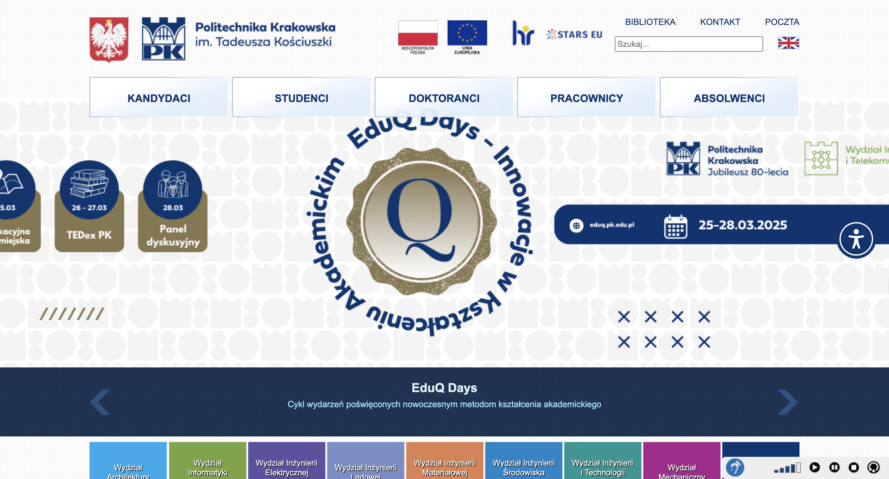
Desktop (3024 x 1964px)
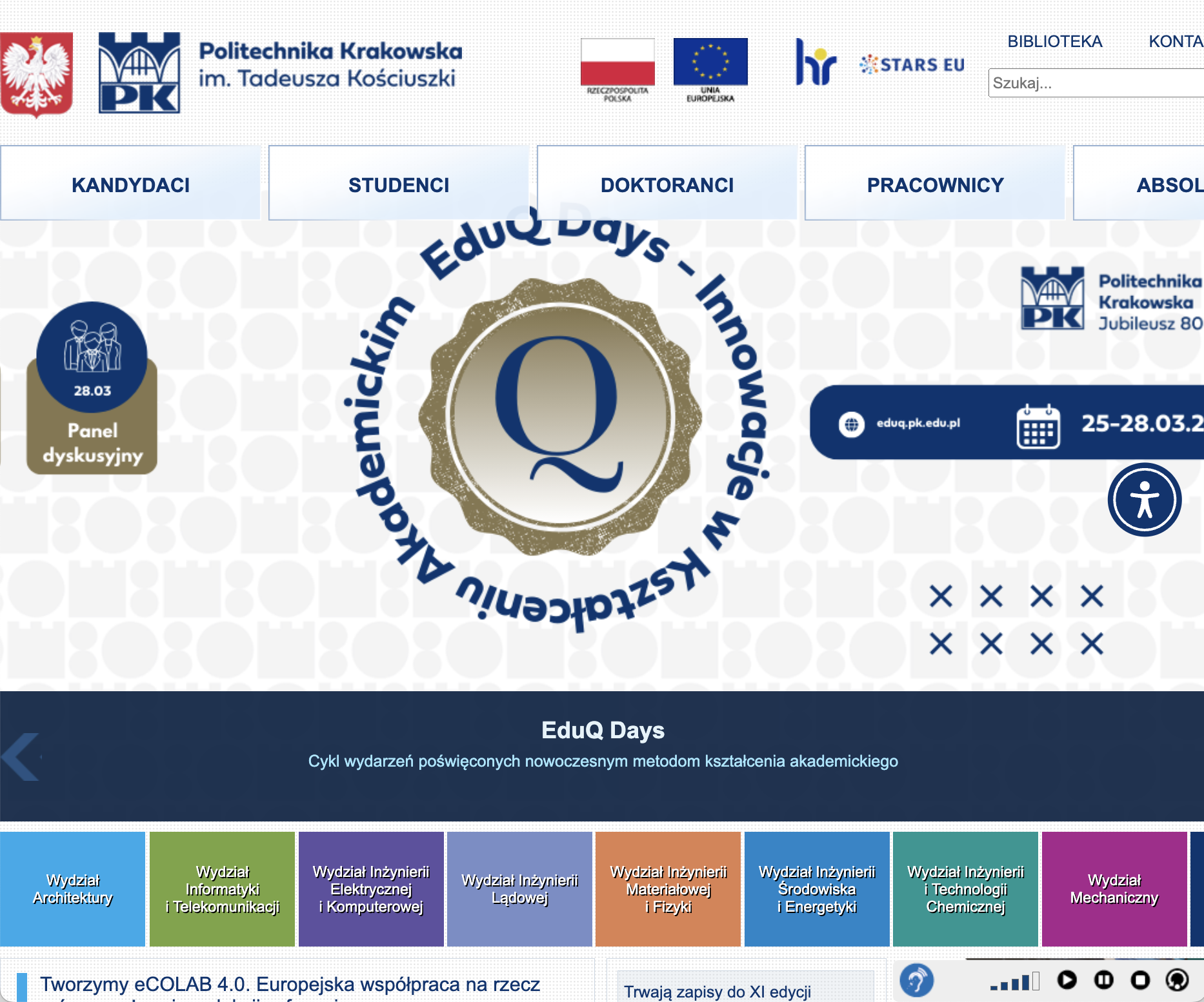
Tablet (768 x 1024px)
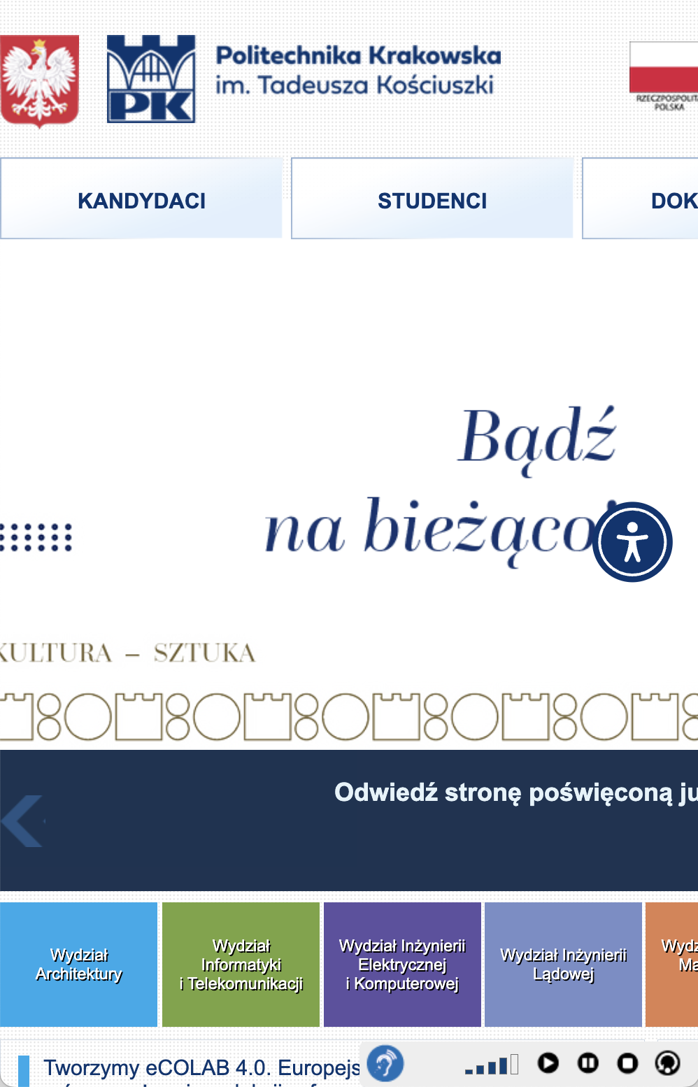
Mobile (375 x 667px)
| Key Issues Identified | Description |
|---|---|
| Navigation & Efficiency |
|
| Learnability |
|
| Memorability |
|
| Accessibility |
|
My redesign enhances the site's visual appeal and usability, featuring a clean, modern aesthetic with intuitive navigation and improved accessibility.
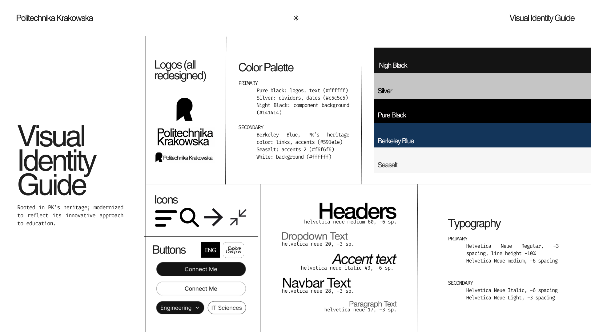
First, before addressing all the issues mentioned in the problems section through code and ensuring responsiveness across all screen sizes, I combined a cohesive visual identity brief reflecting the university's architectural focus. This included modernized logos, custom typography, and a color palette rooted in Politechnika's heritage.
Second, I restructured the site's layout through mockups in Figma, incorporating this aesthetic. The redesign features a simplified, user-friendly navigation system with clear CTAs and intuitive information architecture. View the full Figma project here.
The final deployment of Politechnika's redesigned website can be found here. The screenshots below display the redesigned website on computer, tablet, and mobile screens, while the table describes the changes made to address the issues identified in the problems section.
Desktop (1920 x 1080px)
Tablet (768 x 1024px)
Mobile (375 x 667px)
Overwhelming Navigation: Consolidated 4 navbars into 2 primary menus (a general directory and an expandable departments section) and removed redundant links. Implemented expandable hamburger menu for mobile, ensured responsiveness across all screen sizes (no content cropping of menu items), and simplified navigation access with the primary menu consistently sticked the top of the page.
Poor Responsiveness: Implemented fluid grids ('Explore', 'Recents' sections) and flexible images ('Recents' section), added media queries for breakpoint on mobile, and redesigned components to stack vertically on small screens (the grid within the 'Recents' section changes its shape into a 2x2). All elements adjust to the viewport size: images (within the hero, explore, and recents sections) scale down, and font size decreases gradually rather than jumping at breakpoins.
Accessibility issues: Increased contrast ratios to meet WCAG AA standards, added descriptive alt text for all images, provided comprehensive titles for all links, implemented proper heading hierarchy, and ensured keyboard navigability.
Visual clutter: Established consistent color palette and typography, increased white space for decreased cognitive load, and prioritized appropriate content by establishing clear visual hierarchy.
Poor Learnability: Simplified the homepage to focus on key actions, added hover effects to interactive elements (switch to an italic font style within the navbar, change of background color in the dropdown 'Departments' menu, 'Recents' section, and all buttons to black, scale-up within the 'Explore' grid), and ensured consistent design language throughout the site.