Personas

A case study on the Mail Room Kiosk. Investigates a public interface by capturing users' diverse experiences & needs through interviews & observations, creating personas to assess how well the interface meets those needs.

    ...Questions asked...
    What year are you in?
    What was your first experience with the kiosk like?
    Nowadays, how often do you use the kiosk?
    How important is time efficiency to you when using the kiosk?
    How intuitive do you find the kiosk's digital display and the card reader?
    Have you encountered any difficulties while using it?
    If you could change one thing about the kiosk, what would it be?
    What do you like about the kiosk?
Sketch of Self-Checkout Station
...Observations...

Retrieved by observing 5+ students at Brown University using the Mail Room Kiosk to craft personas for interface evaluation.

Many users struggled with the card reader, often having to swipe their Brown ID multiple times before it was properly recognized.
Users frequently showed signs of frustration, like sighing or repeatedly swiping their cards with increasing force.
When the card reader failed, the system sometimes truncated the login ID, causing users to wait for the interface to reset before trying again. Freshmen (as interviews revealed) were particularly confused by this.
After logging in, users generally found the digital display clear when showing the number of packages, but some hesitated before clicking "Confirm," suggesting the button’s function might not be immediately obvious.
Time efficiency appeared to be a major concern — users often became impatient when delays occurred due to card reader issues or system resets.
...Personas...

Crafted based on interviews and observations to provide realistic representations of different user types,
allowing for more user-centered design decisions and a better understanding of their needs, behaviors, and
pain points.

Anxious Amber

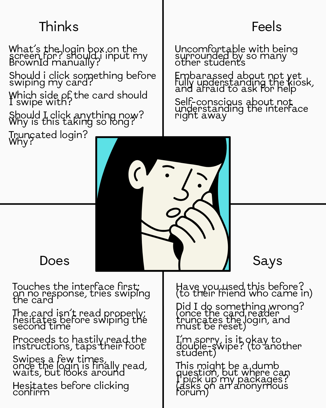
A nervous freshman, new to the mail room kiosk, unsure about the process and uncomfortable with asking for help.

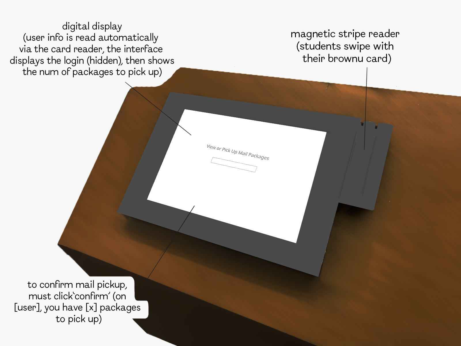
Interface Problems: Lack of guidance on how to use the car reader properly. Confusing badges prohibiting from swiping the card twice (despite it often being the only way for the system to work). Unclear feedback when the card reader fails to recognize the Brown ID. Slow response times, leading to confusion. Lack of guidance on where to pick up the packages upon confirming.

Empathy Map for Anxious Amber - the unsure freshman

Efficient Jamie

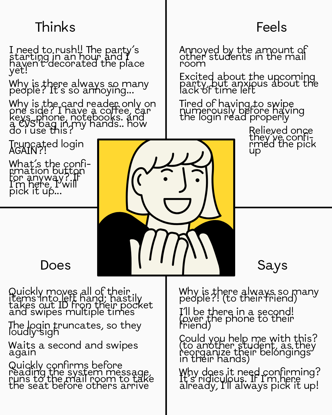
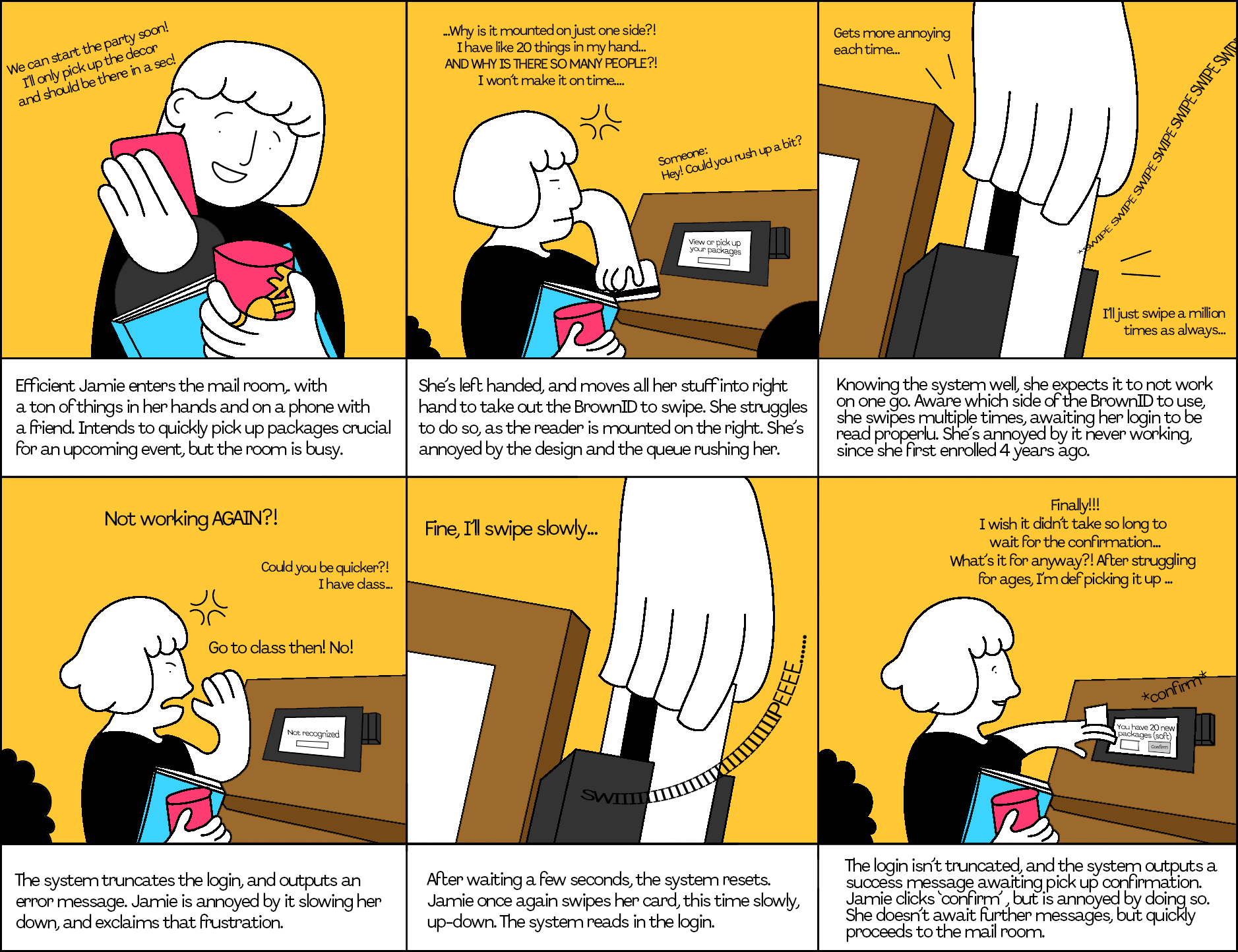
A busy, but confident senior juggling multiple responsibilities and rushing to complete tasks, well-acquainted with the mail room kiosk.

Interface Problems: Poor card reader design (mounted on only one side and uncomfortable to use). Unreliability of the reading system (doesn't always work on one swipe). Slow response times, the need for subsequent confirmation.

Empathy Map for Joyful Jamie - the confident senior
...Efficient Jamie's Storyboard...

Visually maps out the interaction with the kiosk of a well-acquainted with the system user, helping to
illustrate their experience, emotions, and difficulties faced step by step to identify areas for improvement.

Efficient Jamie's Storyboard, showing her process of using the kiosk.